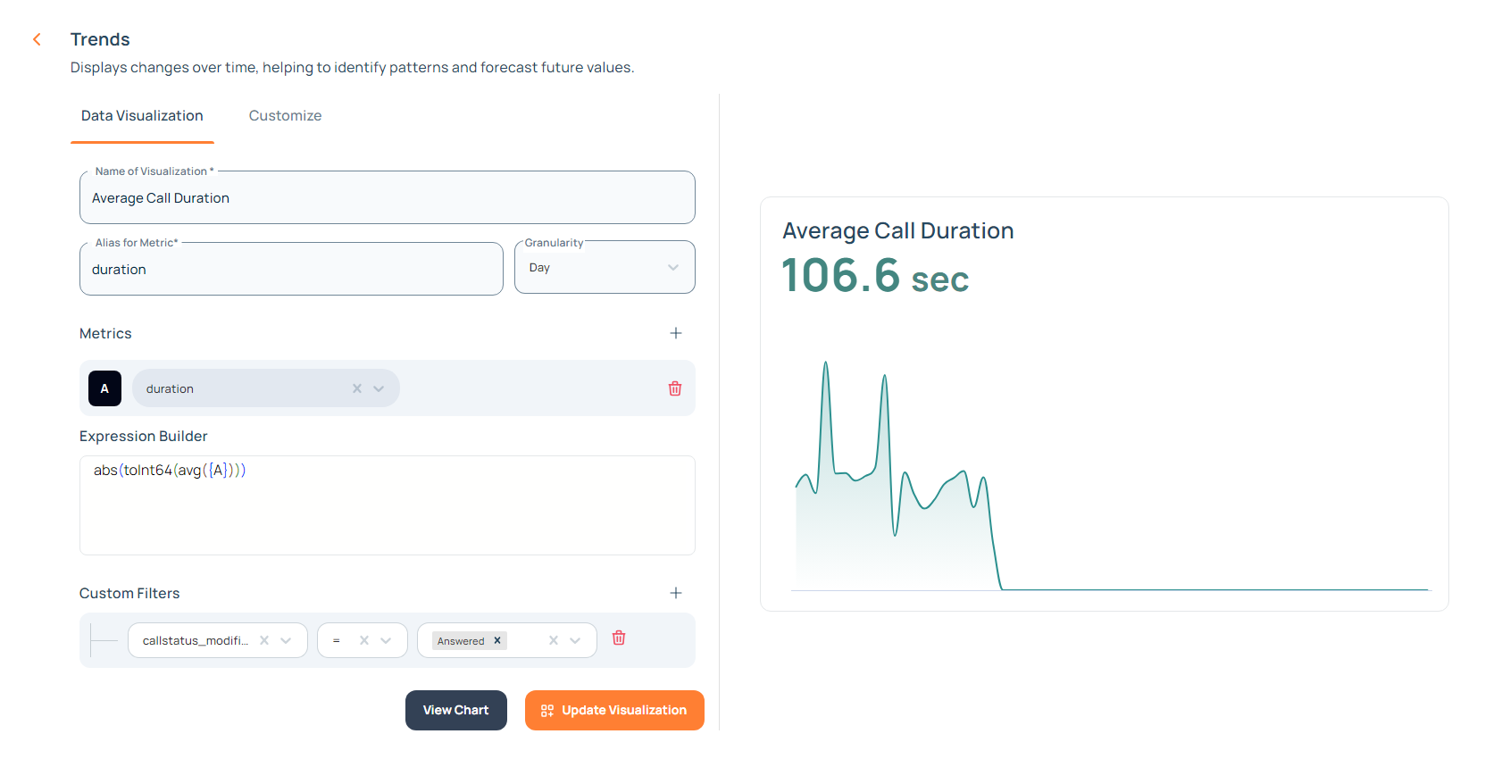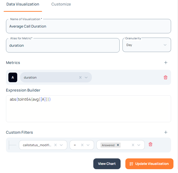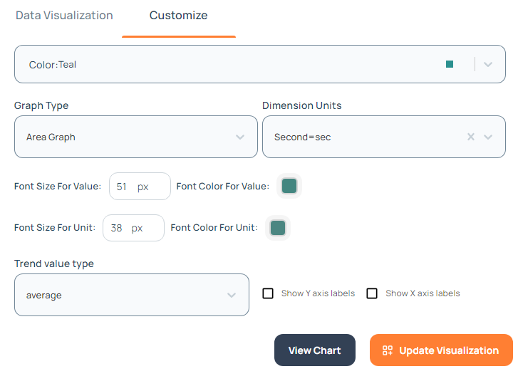


| Function | Attribute Structure | Usage |
|---|---|---|
| sum() | (attribute) | sum(C1) |
| sumIf() | (attribute, filter) | sumIf(C1, conditions) |
| avg() | (attribute) | avg(C1) |
| avgIf() | (attribute, filter) | avgIf(C1, conditions) |
| count() | (attribute) | count(C1) |
| countIf() | (attribute, filter) | countIf(C1, conditions) |
| uniq() | (attribute) | uniq(C1) |
| uniqIf() | (attribute, filter) | uniqIf(C1, conditions) |
| min() | (attribute) | min(C1) |
| max() | (attribute) | max(C1) |
| least() | (attribute1, attribute2) | least(C1, C2) |
| greatest() | (attribute1, attribute2) | greatest(C1, C2) |
| date_diff() | (return type, attribute1, attribute2) | date_diff('second', C1, C2) |
| Operator | Action | Example Usage |
|---|---|---|
| + | Addition | uniq(C1) + uniq(C2) |
| - | Subtraction | uniq(C1) - uniq(C2) |
| / | Division | uniq(C1) / uniq(C2) |
| * | Multiplication | uniq(C1) * uniq(C2) |
| Function | Description | Usage |
|---|---|---|
| abs() | Return the absolute value of a number | abs(C1) |
| toInt8() | Converts a value to an 8-bit integer | toInt8(C1) |
| toInt16() | Converts a value to an 16-bit integer | toInt16(C1) |
| toInt32() | Converts a value to an 32-bit integer | toInt32(C1) |
| toInt64() | Converts a value to an 64-bit integer | toInt64(C1) |
| toString() | Converts a value to a string | toString(C1) |
| Function | Description | Usage |
|---|---|---|
| toTimeStamp() | Converts a value to timestamp | toTimeStamp(C1) |
| toWeekDay() | Converts a date to the corresponding day of the week | toWeekDay(C1) |
| toUTCHour() | Converts a time to its UTC Hour | toUTCHour(C1) |
| toMonth() | Converts a date to its corresponding month | toMonth(C1) |
| toDate() | Converts a value to a date format | toDate(C1) |
